Showing posts with label Communicating with Images in Art and Design. Show all posts

Friday, June 6, 2014

Communicating with Images Final Project - Painting

Final:


mess


Interpretation:
From the first idea, I am actually drawing a family tree painting but my ideas change suddenly due to my mood when drawing it. I face difficultly and hard to draw. My hand shake when I paint, so then I took a long rest after I did the mess on my painting. I go on internet and try to find others reference and the quote"If you're going though hell, keep going" come up to me. That is how I have a new idea drawing an abstract painting which become my final outcome. A black flower with a bright background which I want to bring out the message of : life is simple, but we making it complicated. Everything are actually very simple and easy but we ownself making it all complicated and hard to solve. The stroke of red and orange colour to show the path of life and black show how we go and think. Why do we always make stuff hard to go? Simple is the best. I like simple. Thanks.

 -------------------------------

 Reference:


Tuesday, May 6, 2014

Communicating with Images Task 6 - Movie Poster Interpretation

Movie Poster Interpretation: 
The Amazing spider-man 2

The Amazing Spider-Man 2: Rise of Electro
The plot’s main villain this time around is Electro (Jamie Foxx), originally known as Max Dillon, an electrical engineer at OsCorp. While tending to some maintenance in an OsCorp laboratory, he loses his balance and falls into a tank of genetically modified electric eels. They attack him, and he mutates into a living electric generator.

Interpretation:
This poster is using a red spider which is the spider man symbols logo and behind is electrical flows which is this episode story line. 

 
Teaser Poster

--------------------------------------------

T
The Phantom of the opera:
The Phantom of the Opera (French: Le Fantôme de l'Opéra) is a novel by French writer Gaston Leroux. It was first published as a serialisation in Le Gaulois from September 23, 1909 to January 8, 1910. It was published in volume form in April 1910 by Pierre Lafitte. The novel is partly inspired by historical events at the Paris Opera during the nineteenth century and an apocryphal tale concerning the use of a former ballet pupil's skeleton in Hector Berlioz's 1841 production of Der Freischütz. Nowadays, it is overshadowed by the success of its various stage and film adaptations. 

Plot:
Opera singer Christine triumphs at the gala on the night of the old managers' retirement. Christine is kidnapped by the phantom, and taken to his home in the cellars of the Opera. He plans to keep her there for a few days, hoping she will come to love him. But she causes Erik to change his plans when she unmasks him and, to the horror of both, beholds his face which resembles the face of a rotting corpse. 

Interpretation:
Because of a man having a face of a rotting corpse, so that is why he is been called by others the phantom of the opera. All the time, he is wearing a mask to cover his face so in this poster it show that the half side mask which wear by the phantom.

Tuesday, April 29, 2014

Communicating with Images Task 5 - Logo Interpretation


Google Logo Interpretation
In 1998, Sergey Brin created a computerized version of the Google letters using the free graphics program GIMP. The typeface was changed and an exclamation mark was added, mimicking the Yahoo! logo. "There were a lot of different color iterations", says Ruth Kedar, the graphic designer who developed the now-famous logo. "We ended up with the primary colors, but instead of having the pattern go in order, we put a secondary color on the L, which brought back the idea that Google doesn't follow the rules."

In 2010, the Google logo received its first major and permanent overhaul since May 31, 1999. The new logo was first previewed on November 8, 2009, and was officially launched on May 6, 2010. It utilises an identical typeface to the previous logo, but the "o" is distinctly more orange-colored in place of the previously more yellowish "o", as well as a much more subtle shadow rendered in a different shading style. On September 19, 2013, Google introduced a new "flat" (two-dimensional) logo with a slightly altered color palette. The old 2010 Google logo is still used on some pages, such as the Google Doodles page.

It might be that colors are assigned to letters according to whether their positions represent a prime number or don’t. Thus letters number 1, 2, 3 and 5 (all of them prime numbers) have a distinctive or “prime” color assigned: blue, red, yellow and green. Letters number 4 and 6 (not prime numbers) repeat colors -no longer “prime colors”- in the same order that such colors were assigned in the first time: blue and then red. If the sequence were to continue with new letters, the next letter, number 7, should have a new or “prime color” since 7 is prime; letters number 8, 9 and 10 should repeat colors in the pre established order: yellow, green and the same as 7′s; letter number 11, also a prime number, should have another new color, and so forth.

Communicating with Images Task 5 - Create own logo

Task 5 - Create own logo

Sketch 1

Sketch 2

Outer me and Inner me

Interpretation
The outer me which is the smiling clown. I always act as a clown among friends to entertain them, make them happy and smile all the time. I am always the center of joy for friends. Be my friends and you can be happy all the time.

The inner me is... terror...from my look you will never thought that I am stingy and getting angry over little things. I love leopard skin so my logo have leopard on it. A sharp teeth in the mouth means that I am tit for tat. Do not make me hate you or you will get hurt badly in the end because I will tear you apart. 

So you wanna be my best friends or worst enemy? 

Final - my own style logo
So cute...laugh out loud...

Sunday, April 6, 2014

Communicating with Images - Task 4.3

Task 4.3 - Draw a portrait of self

1st portrait

Hair = grass/ broom
eye = no eyes because see everything went wrong
ears = music
nose = soup
mouth = chocolate
cheek = a kiss from mummy
face = full of small holes

2nd portrait

Brain = full of money / creative
Ears = Listen from left Out from right
Eyes = Look out for love, Family and friends
Nose = Smell the nature
Mouth = Eat the home cooking

Illustrator and Photoshop


Saturday, April 5, 2014

Communicating with Images - Task 4.2

Task 4.2 - A Song related to myself - Draw something from it.


The song lyrics and translate

童年的荡秋千 随记忆一直晃到现在 ( The memory from the past still wandering with the swing)

ㄖㄨㄟ ㄙㄡ ㄙㄡ ㄒ一 ㄉㄡ ㄒ一
ㄌㄚ ㄙㄡ ㄌㄚ ㄒ一 ㄒ一 ㄒ一 ㄒ一
ㄌㄚ ㄒ一 ㄌㄚ ㄙㄡ

吹着前奏望着天空 我想起花瓣试着掉落 ( Memory from the past)

为你翘课的那一天 花落的那一天 ( Skip class just because of you )
教室的那一间 我怎么看不见 
消失的下雨天 我好想再淋一遍 ( I hope that I can be in the disappear rain )

没想到失去的勇气我还留着 ( I never though I still have the courage)
好想再问一遍 你会等待还是离开 ( to ask : will you stay or go? )

刮风这天 我试过握着你手 ( I tried to hold your hand)
但偏偏 雨渐渐 大到我看你不见 ( But I didn't see you there)
还要多久 我才能在你身边 ( How long does it take for me to be with you)
等待放晴的那天 也许我会比较好一点 ( Maybe I will be better when it is sunny)

从前从前 有个人爱你很久 ( There is a person who love you long time ago)
但偏偏 风渐渐 把距离吹得好远 ( But the wings just blow the relationship so far away)
好不容易 又能再多爱一天 ( It is not easy to love one more day)
但故事的最后你好像还是说了拜拜 ( But in the end you still say bye bye)

---------------------------------------------------


This mv shown a memorable love. From the first screen the girl sent a letter with hesitation, but in the end she still sent it. Then the following part is some screen of the past memory from them. The guy skip class to meet the girl and play the double bass in the rain. All the picture sent to the guy is written as "Jay I Love You" that show they both cannot forget about this relationship and still love each others, but the girl already left. 

---------------------------------------------------

My Drawing:

first

Second

Third

Photoshop

Interpretation
I always did my best to entertain everyone but no one appreciate me.
I am feeling down and sad because of everyone ignore.
Crying in a dark room in night with lot of tears coming from my eye.
How come in this colurful world, I am feeling so alone and helpless.
Why is human so greedy and foolish, do not appreciate what is around them 
and wait until they lose it only they want it back but it is too late.
In this coolourful world, I am crying hopelessly in a dark corner.

Wednesday, April 2, 2014

Communicating with Images - Task 4.1

Task 4.1 - A Painting or Image that related to myself. Describe it with words more then 100 words.


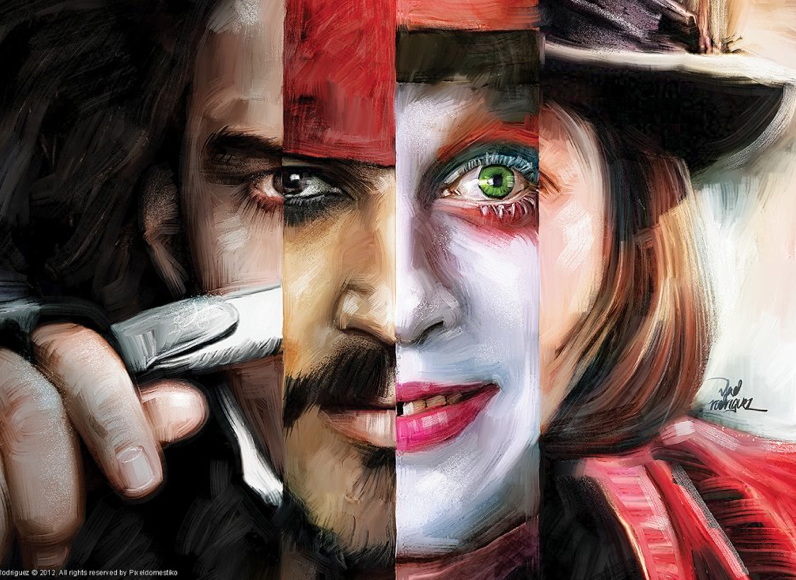
This painting do describe a little about myself, I am very emotional and sensitive against anything and everything. Emotion is often the driving force behind motivation, positive or negative thinking. So as for me I am quite sure I am the one who always have negative thinking which I should change it. Easily affected by something is not good because emotional will lead to solve the problem which is not rational. Doing thing according to my mood and feel is my biggest weakness of all time, that is why I have very weak time management.  I get mad and sad easily even with a little small problem that can cause me down and unhappy for some time. Friends would think that I have split personality which is quite scary because I change easily. 
Every mood and feel, I showed on my face. If you can read my face, you will know a bit how am I feeling now.


Johnny Depp, everyone knows him, he is an American actor, film producer, and musician. He has won the Golden Globe Award and Screen Actors Guild award for Best Actor.
From the above painting we can see that 4 different make-up and mask from different movies.
The 4 movies is Sweeney Todd, Pirates of the Caribbean, Alice in Wonderland and Charlie and the Chocolate Factory. In my memory, Johnny depp was a man which always wear make up in the movie.

For my opinion, I think that a make-up is like a mask covering everything up and show another personality to others people. This is what I see in the society which is double-face. Why must everyone in the society wear the mask?

Tuesday, March 25, 2014

Communicating with Images - Task 3 Local Artist

Pointillism /ˈpɔɪntɨlɪzəm/ is a technique of painting in which small, distinct dots of pure color are applied in patterns to form an image. Georges Seuratand Paul Signac developed the technique in 1886, branching from Impressionism. The term Pointillism was first coined by art critics in the late 1880s to ridicule the works of these artists, and is now used without its earlier mocking connotation. Neo-impressionism and Divisionism are also terms used to describe this technique of painting called pointillism.

Using Acrylic Colour

Using Oil colour
It is in a series from dark colour to light colour.

Flowers Series.

Colour from dark to light mixed by Mr. Sukor self.

Brush and tools that used during painting.

-----------------------------------------------

#prayformh370

Title: Disappearance
Artist: Dr. Hushinaidi
Disappearance 1

Disappearance 2

Disappearance 3

The mock-up used for painting

Bottle with colour for strokes

The texture and effect for painting


Sponge and mock up army for painting


Strokes